더 나은 사진을 만들기 위해 시각적 균형을 사용하는 방법에 대한 7가지 팁
페이지 정보
1,546 2015.12.27 15:34
본문
.출처 http://digital-photography-school.com/7-quick-tips-use-visual-balance-make-better-photographs/
|
Balance is one of the characteristics of good composition. It is the way elements of an image are arranged to create a feeling of stability. If you imagine that your image is a set of scales, all elements of your composition should be balanced to make a photograph feel stable.
There are many ways to create balanced images. The easiest way to achieve it is by using symmetry, as it guarantees left to right, or top to bottom balance. The results look formal, organized, and orderly. If you would like to create a balanced composition that feels more casual, free, and energetic, then use asymmetry. Different colours, shapes and sizes create different degrees of visual interest. So, to achieve asymmetrical balance you need to arrange elements of all different visual weights, when composing your image, in such a way that each side is still balanced out.
There are seven basic factors to consider when you compose your images with visual balance in mind. Let’s have a close look at how you can use these different factors affecting visual weight and gain some advantage. 1 – Colour
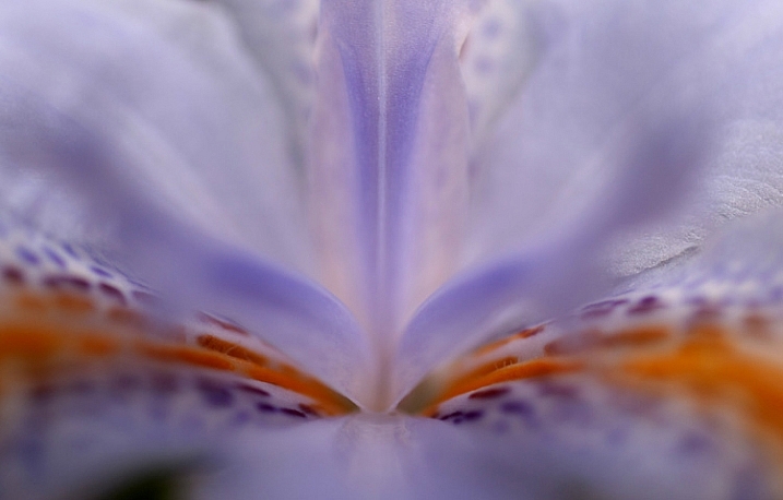
Colour has many properties that can affect an object’s visual weight relative to others in the photograph, such as saturation, brightness, darkness, and hue. Warm colours advance into the foreground and tend to weigh more than cool colours, which recede into the background. Red attracts attention better than any other colour, and thus has the highest visual weight as opposed to yellow, which has the least visual weight. Also bright colours attract more attention than subdued colours. 2 – Size
Large elements appear heavier than small ones. Size is an evident visual weight factor because, in the physical world, an object that’s bigger than another will naturally be heavier, and will take up more physical space. Large elements command more attention. We naturally see them first, or spend more time looking at them anyway. 3 – Value
Value is a powerful tool for balancing images. Dark elements feel heavier than light items. The higher the value-contrast (between object and background), the heavier will be the weight of the object. 4 – Texture
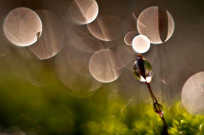
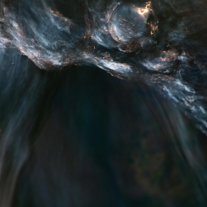
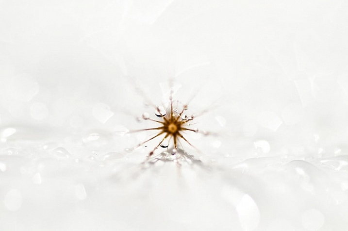
Texture adds visual weight to items in photographs. Texture is just more interesting and our eyes are drawn to it. Smooth areas will feel lighter than those with a lot of heavy texture. 5 – Isolation Objects isolated in a space appear heavier than those surrounded by other elements. Look at the image below with a brown circle on it. Your eyes go directly to the brown circle first because there’s nothing else to see.
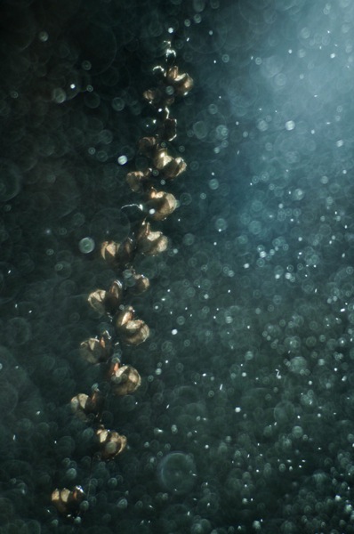
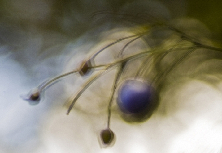
6 – Quantity A few small objects can balance out a single large object. Repetition of objects can be used here as well. In the example below, the three small berries are balancing out the large berry.
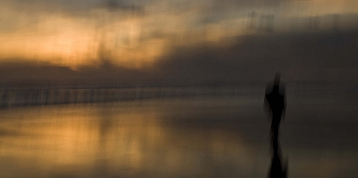
7 – Orientation Vertical objects appear heavier than horizontal objects. A diagonal orientation carries more visual weight than a horizontal or vertical one. Lines can be very powerful in your composition. Pay close attention to them.
Remember, you don’t have to balance colour with colour, or light with dark – you can mix and match your visual weights. For example, a counterweight to a large, bright area might be a small red object. Experiment with different kinds of balance and play around with visual weight. See what works best for your images and the story you want to tell. As you go out exploring with your camera on your next photo shoot, keep balance in mind and the seven factors of visual weight. Look closely and try to determine which elements are commanding the most visual weight when you compose your photographs, and see how they affect balance in your images. If you have any comments or questions please post them below. And we’d love to see your visually balanced images. |

.
글쓴이 명함
nepo 회원등급 : 최고관리자 포인트 : 301,074
Progress Bar 59%

-
공룡능선의 솔나리와 촛대바위
.
nepo 21시간 40분전 4 -
비 내리는 5월 16일
.
nepo 2025-05-16 22:30 24 -
2024 후반 서울 첫눈-관악구
.
nepo 2024-11-27 21:45 93 -
관악산
.
nepo 2024-09-22 17:47 99 -
63빌딩의 저녁
.
nepo 2024-09-15 19:33 103 -
하늘 달 구름 산 그리고 건물
.
nepo 2024-09-14 18:56 108 -
아카시 향기 속 관악 야경
.
nepo 2024-05-04 22:14 108 -
아카시 꽃
해마다 보는 아카시 꽃
nepo 2024-05-03 10:42 103 -
비온 후의 신록
.
nepo 2024-04-24 12:12 94 -
가까이 그리고 멀리서 본 북한산
.
nepo 2024-03-26 20:28 99
-
귀엽습니다~ nepo 2022-12-07 00:12
-
 곰팡이색이 검은색이 아니고 흰색이라 곰팡이만 걷어내고 먹으면 된다고 합니다. 냉장 보관하시… 안알랴줌 2022-08-19 18:21
 -
너무 방치히는거 아닌가요? ? 도메인이 만료되기 전에 연장하라는 메일이 갈텐데? 안알랴줌 2022-06-28 17:03
-
 점점 고물이 되어가는 모든것과 함께 아직은 즐거운 마음으로 삽니다 ㅎㅎ † ЌûỲắـĶĬΣ 2022-06-26 07:04
 -
 오오! Kuyakim님 오랜만입니다! 먼 타지에서 건강히 잘 지내시는지요 :) 풀림 2022-06-25 23:21
 -
그런 카페가 한두곳이 아니죠 쓴소린 듣기 싫고 그런~ † ЌûỲắـĶĬΣ 2022-06-22 10:08
-
수고 많았네요^^ nepo 2022-06-22 00:29
-
허헛. 오랜만에 접속해보니 도메인이 죽어있어서 부랴부랴 살렸습니다. nepo님께 따로 연락… 풀림 2022-06-21 23:31
-
에구 너무 속상하시겠어요...ㅠㅠ 풀림 2022-06-21 23:30
-
제가 수정했습니다^^ nepo 2022-01-06 00:56


Ranking
-
01 안알랴줌241,207
-
02 † ЌûỲắـĶĬΣ214,573
-
03 봉자아범200,485
-
04 한댜139,334
-
05 고슴도치132,659
-
06 날좋은날예쁘게108,482
-
07 viva103,258
-
08 물빛102,791
-
09 돌팔매76,544
-
10 fomosan45,265
-
01 † ЌûỲắـĶĬΣ56,396
-
02 안알랴줌38,589
-
03 한댜38,235
-
04 고슴도치35,039
-
05 물빛28,982
-
06 돌팔매27,560
-
07 봉자아범20,346
-
08 fomosan18,529
-
09 강달프17,013
-
10 오키드15,321
댓글목록
등록된 댓글이 없습니다.